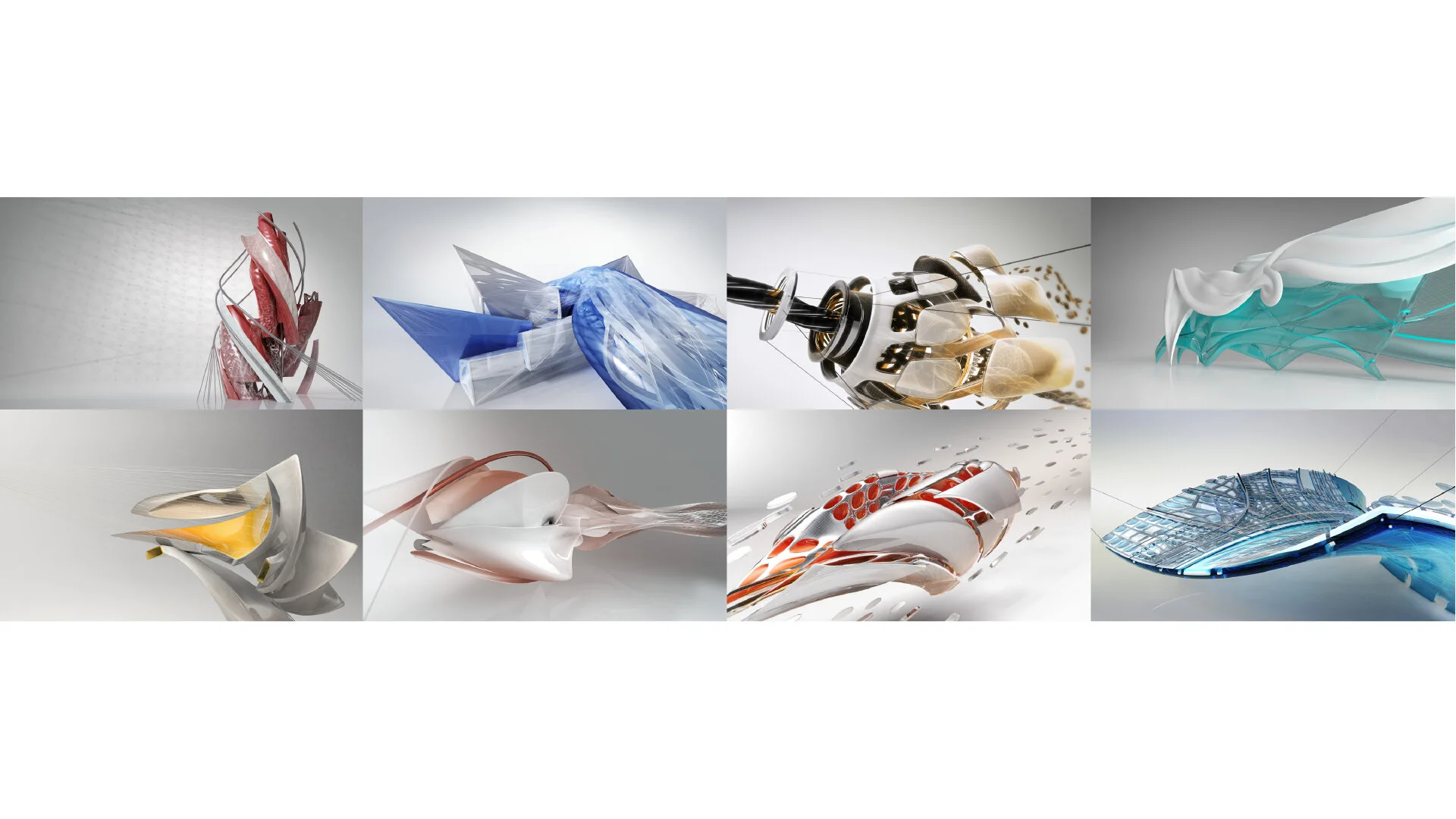
Autodesk 2013 rebrand
When Autodesk chose to take on a brand refresh in 2012, it was to signal a profound business transformation, from selling perpetual licenses to becoming a software as a service business, in every market it serves.
The new logo needed to effectively stand for Autodesk’s corporate vision, and represent the depth, breadth of Autodesk’s business and full line of software products. It was derived from the concept of origami, as the convergence of art and science upon which Autodesk’s software products are based.
The entire brand visual system, including the product identity was created by Autodesk’s in-house brand creative team, in 4 months.


